first of all, a bit of context
I produced the work presented in this portfolio in my spare time in order to give an overview of my work as an UX/UI Designer.
The projects I’ve been involved in since the start of my career are all strictly confidential. It was therefore necessary for me to put together a personal project.
I chose a video game because I want to work in this sector as a UX/UI Designer.
I opted for God of War 4 because I particularly like this game and I thought it was popular enough to appeal to a wide audience.
I hope you enjoy the read!
Game overview
God of War is an action-adventure game developed by Santa Monica Studio and published by Sony Interactive Entertainment. It was released for the PlayStation 4 in April 2018, with a Windows port in January 2022. The game is the eighth installment in the God of War series. Unlike previous games, which were loosely based on Greek mythology, this installment is loosely inspired by Norse mythology, with the majority of it set in ancient Scandinavia in the realm of Midgard.
The game received universal acclaim for its story, world design, art direction, music, graphics, combat system, and characters, in particular the dynamic between Kratos and Atreus.
From Wikipedia
I enjoyed playing the game because of the quality of its narrative, characters, gameplay and action. I’would also like to pay tribute to the ingenuity of the camera management, which makes it possible to experience the most epic cinematics without interrupting the gameplay, enhancing the player’s immersion.
Although the aim of this study is to optimize the gaming experience for the God of War 4 (2018) inventory, I am aware that I am taking a critical look at a product that is the result of several years of production by talented teams. The design elements discussed in this review are discussed from an outsider’s perspective, which lacks the context of the reasons and conditions behind the choices that were made. Solely assumptions can be made about these choices and the resulting designs.
As a final note, I must mention that user experience is far more larger than the inventory management. Through this project, I therefore contribute only to a small parcel of the great land of user experience.
It is finally with deep respect that I undertake the difficult task of proposing an improvement to God of War 4 inventory management.
The problem – guidance and information architecture
The God of War 4 interface used to equip Kratos and Atreus presents numerous guidance problems. These confuse the user, who then feels lost in the menus and choices available to him.
My aim is to clarify how the inventory works and to simplify the user’s path.
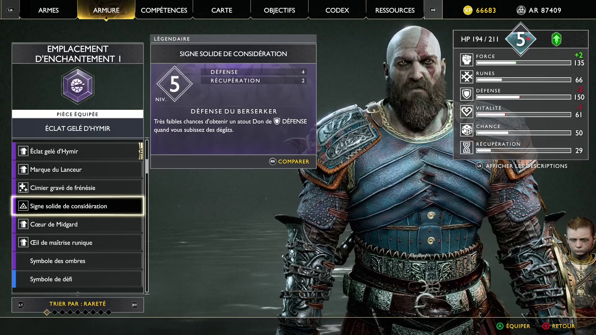
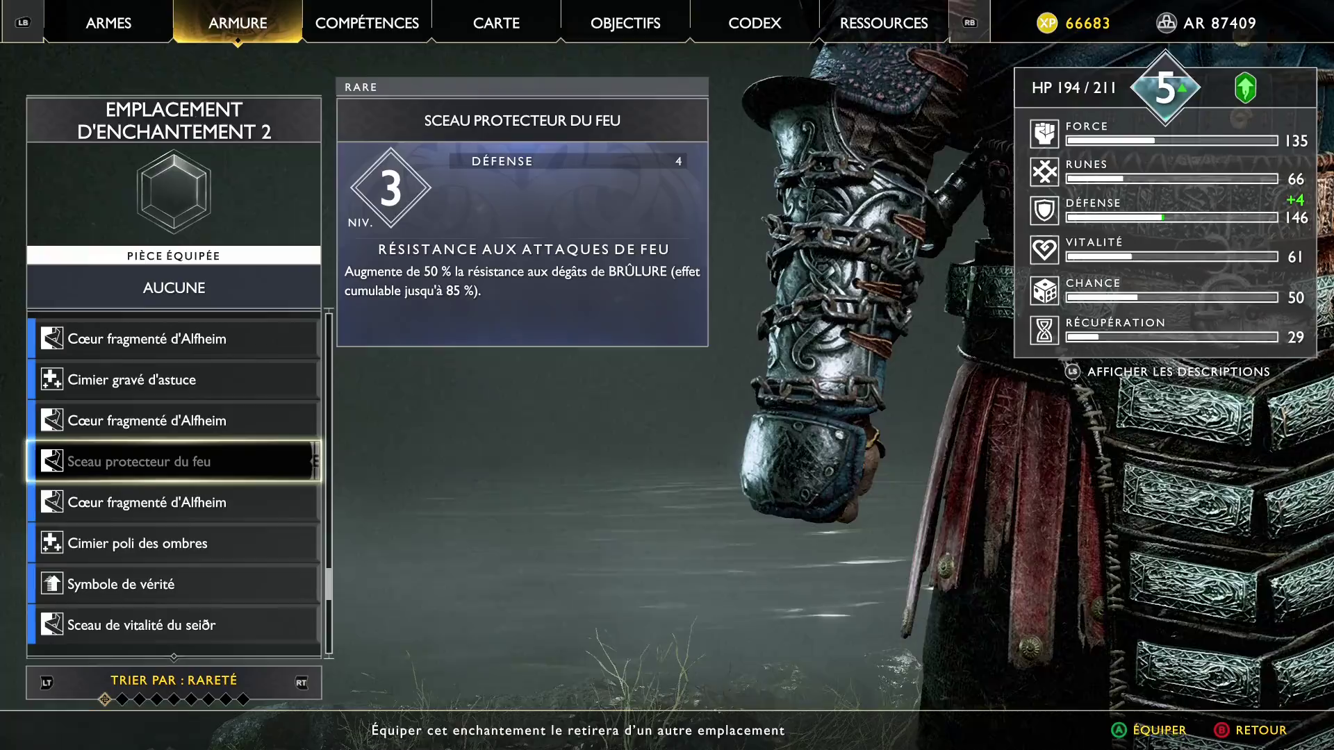
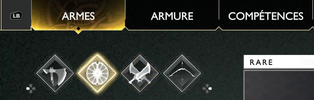
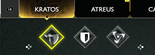
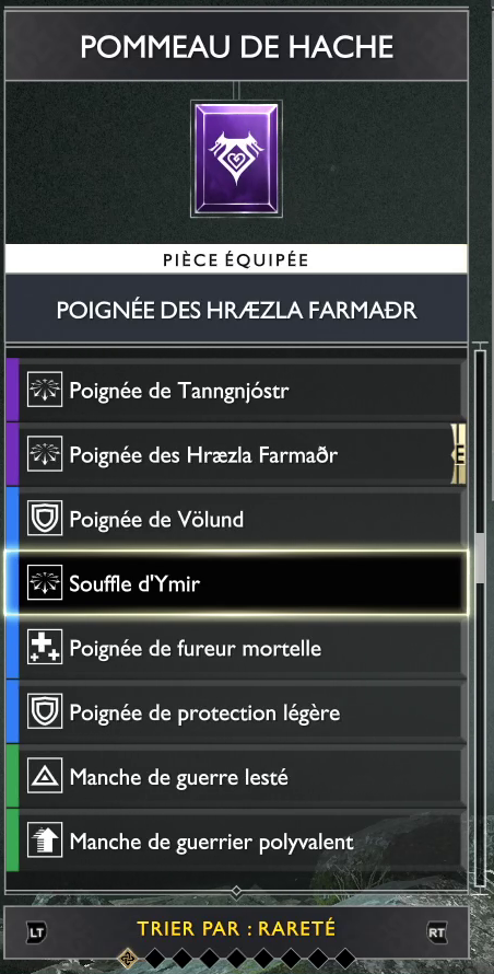
Adding enchantments to an item. But which one ?
Is it for shoulders, chest or legs ?
Is the item already equipped ?
For a more accurate depiction of the problems and their solutions, check the Design insights chapter below.
User definition
User research is the phase during which the designer defines his target and the determinants of his activity. It is essential because it is the basis on which the designer makes his design hypotheses.
The user and the activity are modelled by the persona and the workflow respectively.
In particular, I look at the frequency of inventory changes, typical behaviours and the goals our personas are trying to achieve. From these stem their frustrations.
In my designs, I take care to give personae the tools they need to achieve their goals with ease.
The personae
A persona is a fictional, stereotyped representation of an end user. There can be as many personae as there are different types of user.
The persona is used to keep in mind the determining characteristics of the user for the design of the interface.
The workflows
A workflow is a model of the activity of target users over time.
It enables us to keep in mind the purpose of the interface and to deduce the use cases to be tested in order to validate the design hypotheses.
I have identified three main use cases, divided into as many workflows.
We can see that in the first use case, the user doesn’t need to vizualize Kratos’ statistics, but only the item’s. This will allow us to free some space.
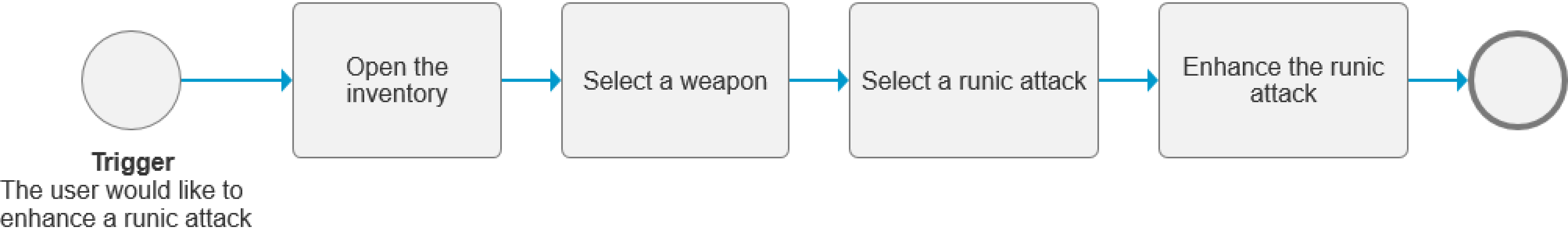
This use case is rather simple in theory and practically. It should stay the same in the new design.
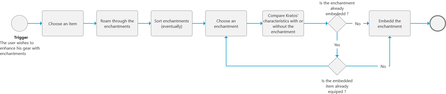
Embedding an enchantment is the most complicated workflow we will study. It requires the manipulation of several concepts such as characteristics, items and sockets. This explains why this workflow is the least well executed in the game.
Conclusion on user definition
At the end of the user research, I conclude on the typical user profiles and their nominal use cases.
Although the workflows are rather simple to ease their comprehension by all the stakeholders, they effectively communicate an optimal user journey to achieve certain activities.
It is on the basis of these conclusions that I can begin to define the interface problems and the corresponding solution insights.
Design insights
This paragraph contains the design insights gained during the analysis of the problem. Each problem has its own solution, as we shall see together.
Focus on the architecture
The architecture problem
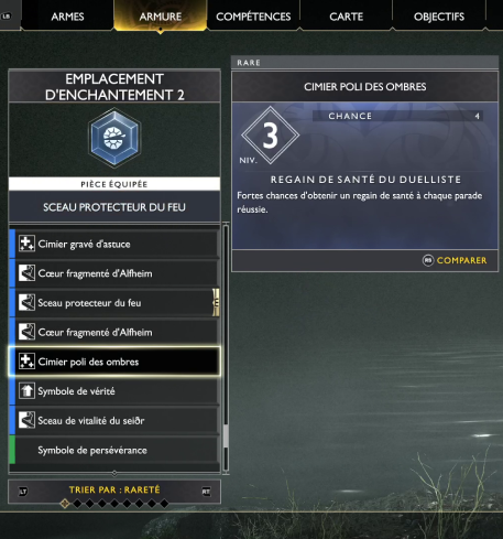
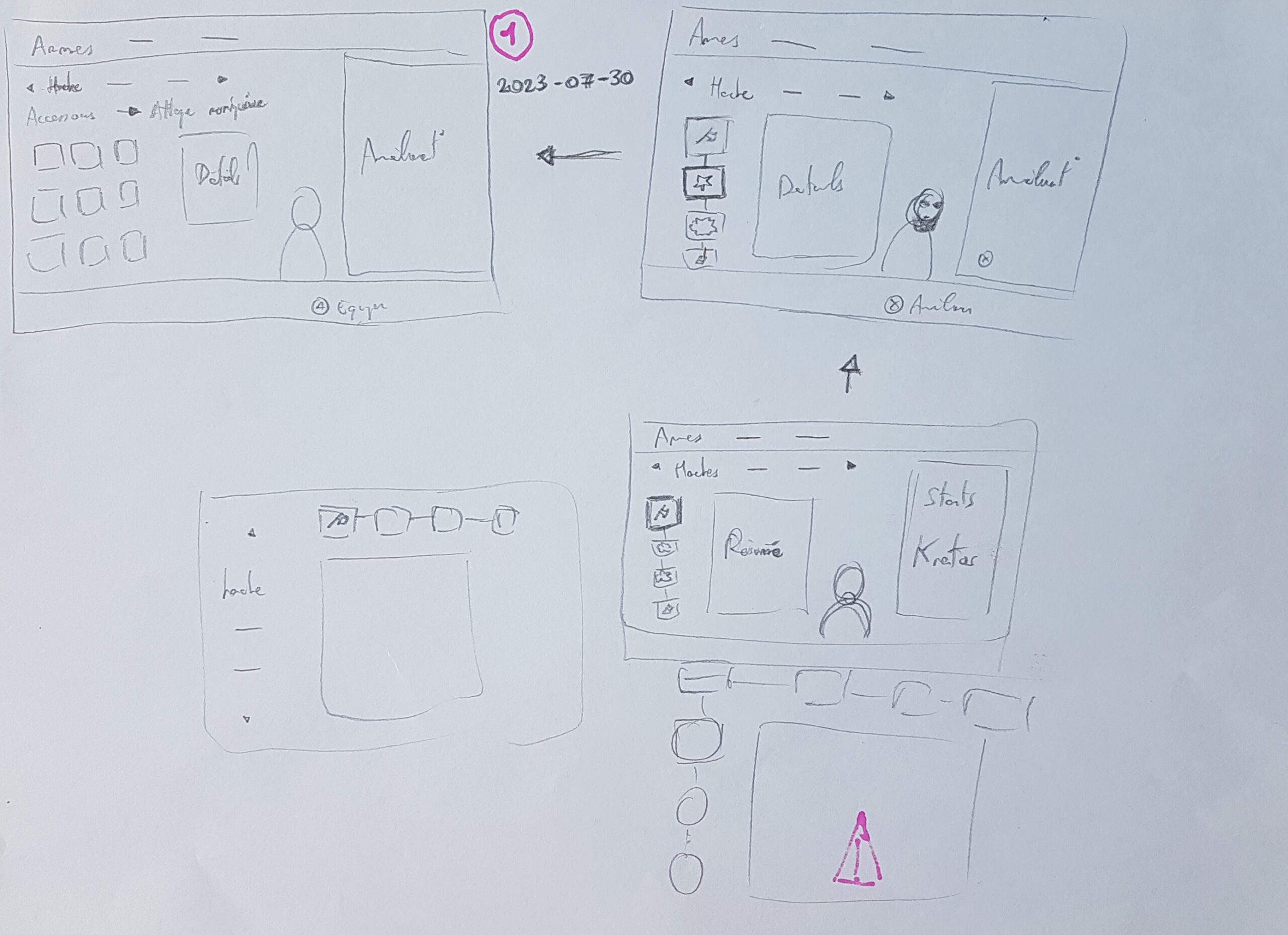
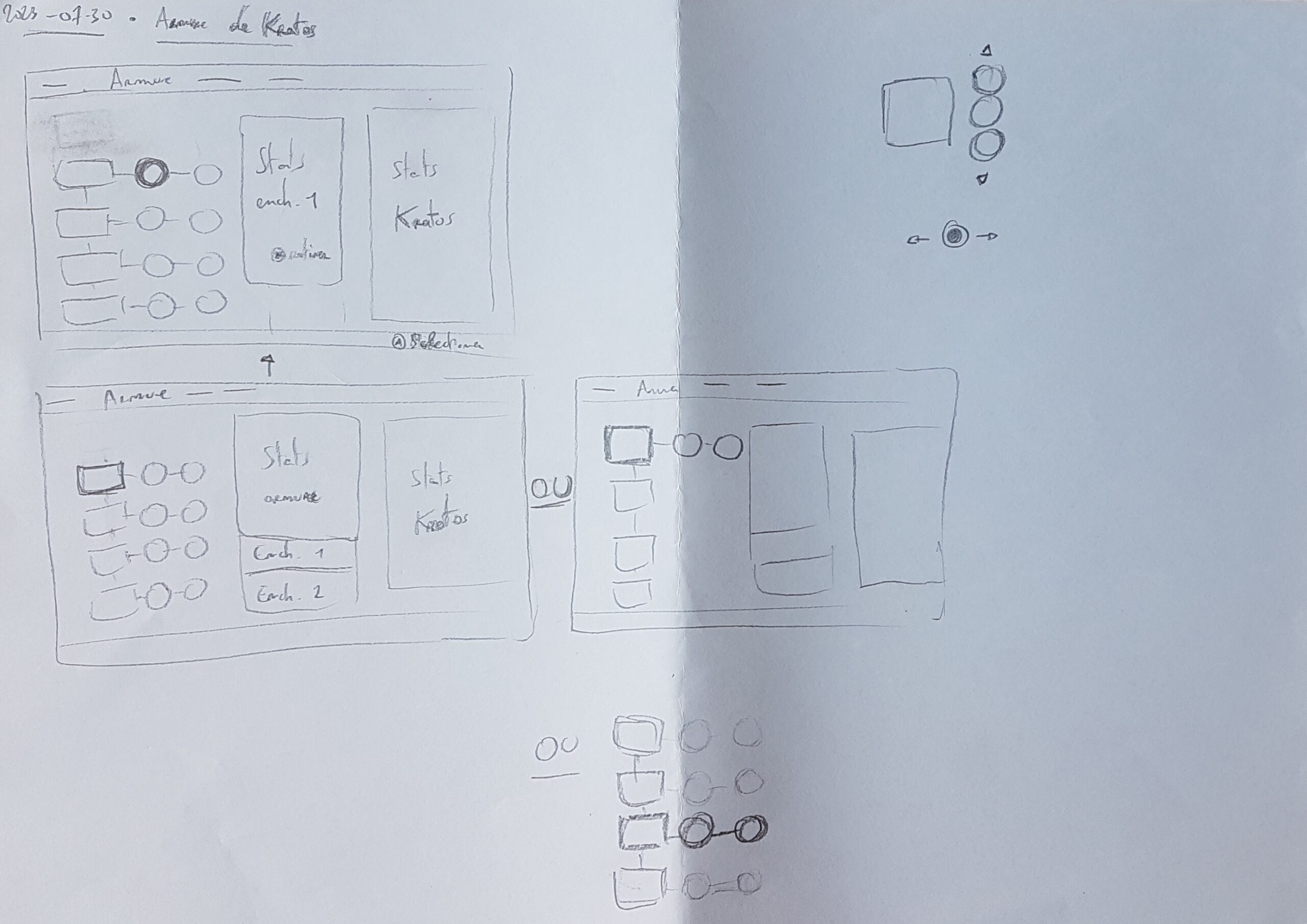
Because of the very vertical information architecture, it is sometimes necessary to perform numerous actions to achieve a single effect.
For example, beginning from the character step, to change two enchantments on an item, you have to :
- Focus the item ;
- Click on “modify enchantments”, or press the corresponding command ;
- Focus on the enchantment socket ;
- Click on the enchantment socket ;
- Browse throught the available enchantments by focusing them ;
- Click to equip ;
- Repeat steps 3 to 6.
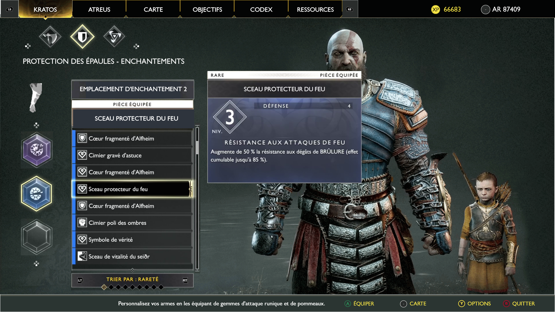
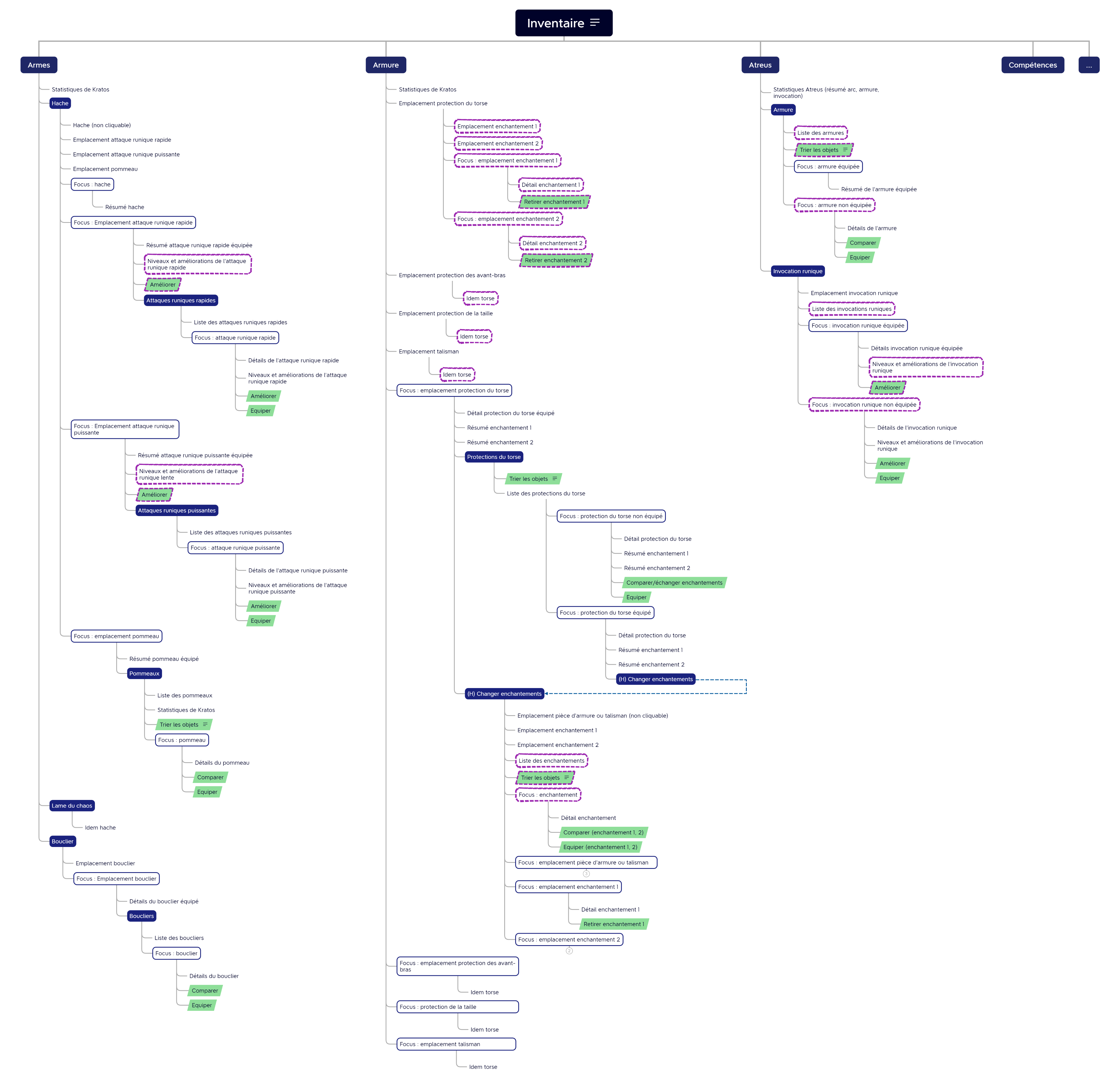
The architecture solution
Adapt the information architecture in a more horizontal wat to limit minimal actions.
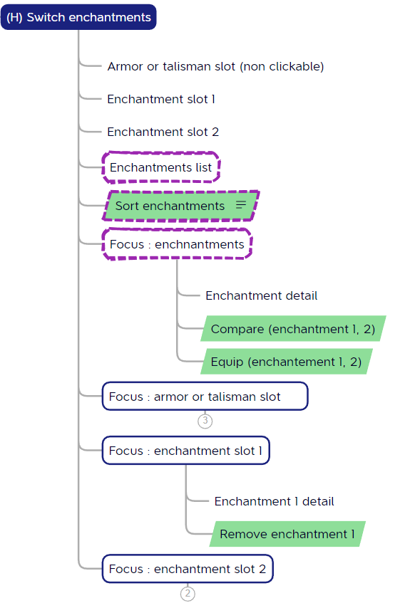
This new architecture proposes the capacity to roam through enchantments simply by focusing them, thus reducing the architecture level required to modify enchantments by one.
See below how the design differs.
The objectives of the proposed new architecture are to:
- Make it easier to try out new play styles by identifying the dominant characteristics of objects ;
- Speed up the enhancement of runic attacks and summonses ;
- Facilitate consultation of equipped enchantments ;
- Simplify modification of enchantments ;
- Simplify entry of Atreus equipment (move to 1st level).
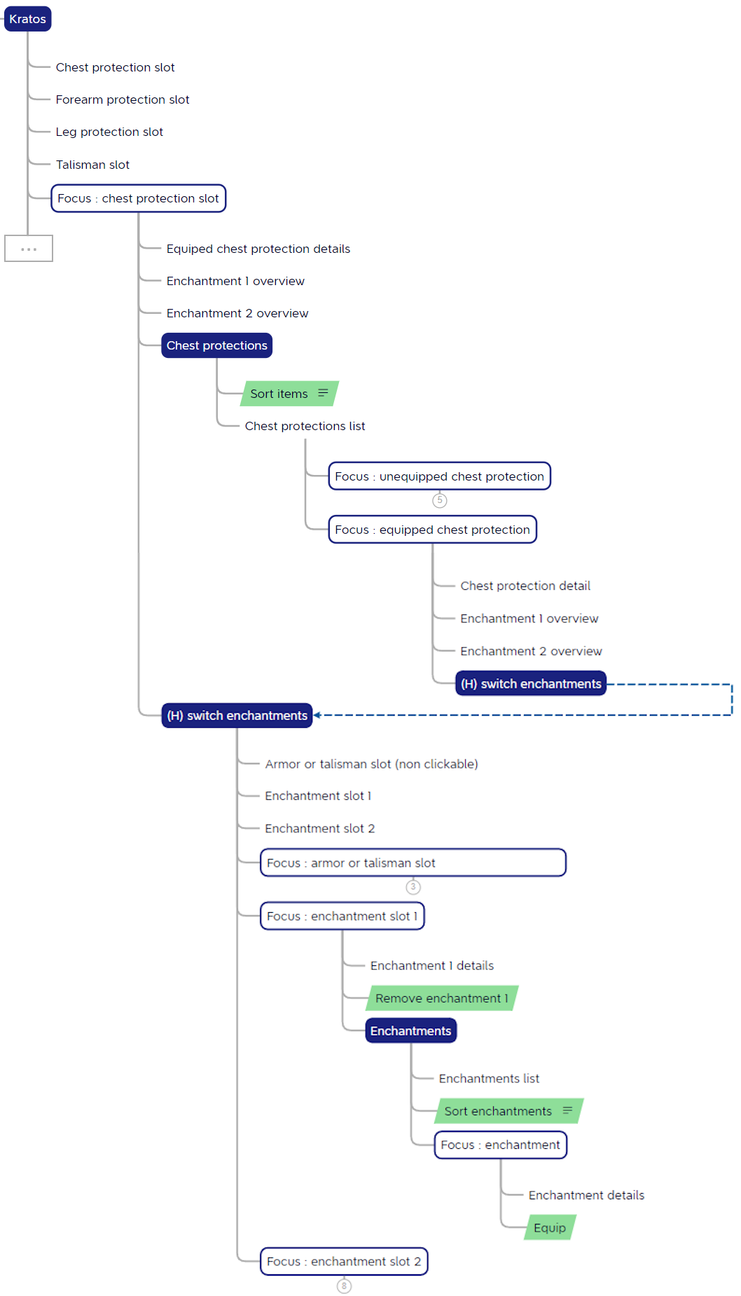
This is only part of the new architecture. The full version of the architecture is available here.
Focus on the inventory
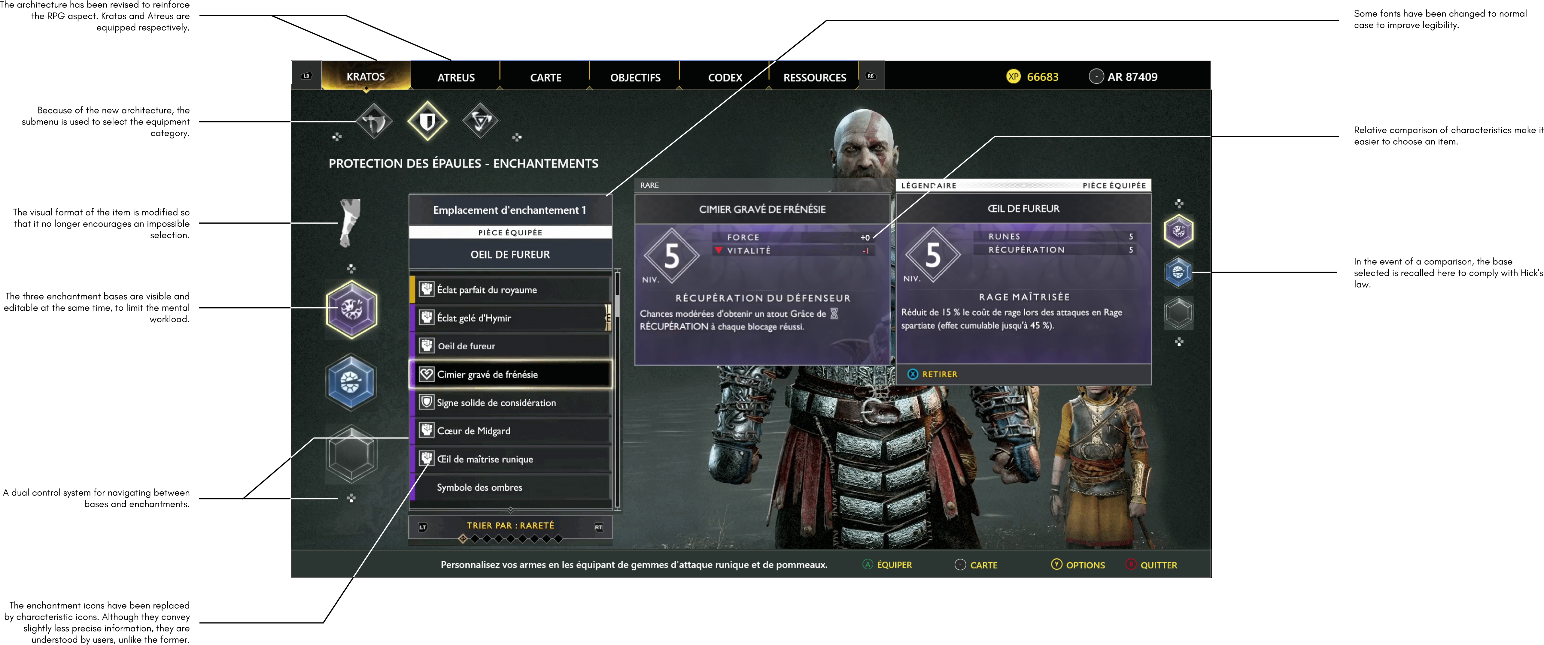
Each of these insights contributed to the final design. They are displayed to help understanding the underlying thoughts behind the design process.
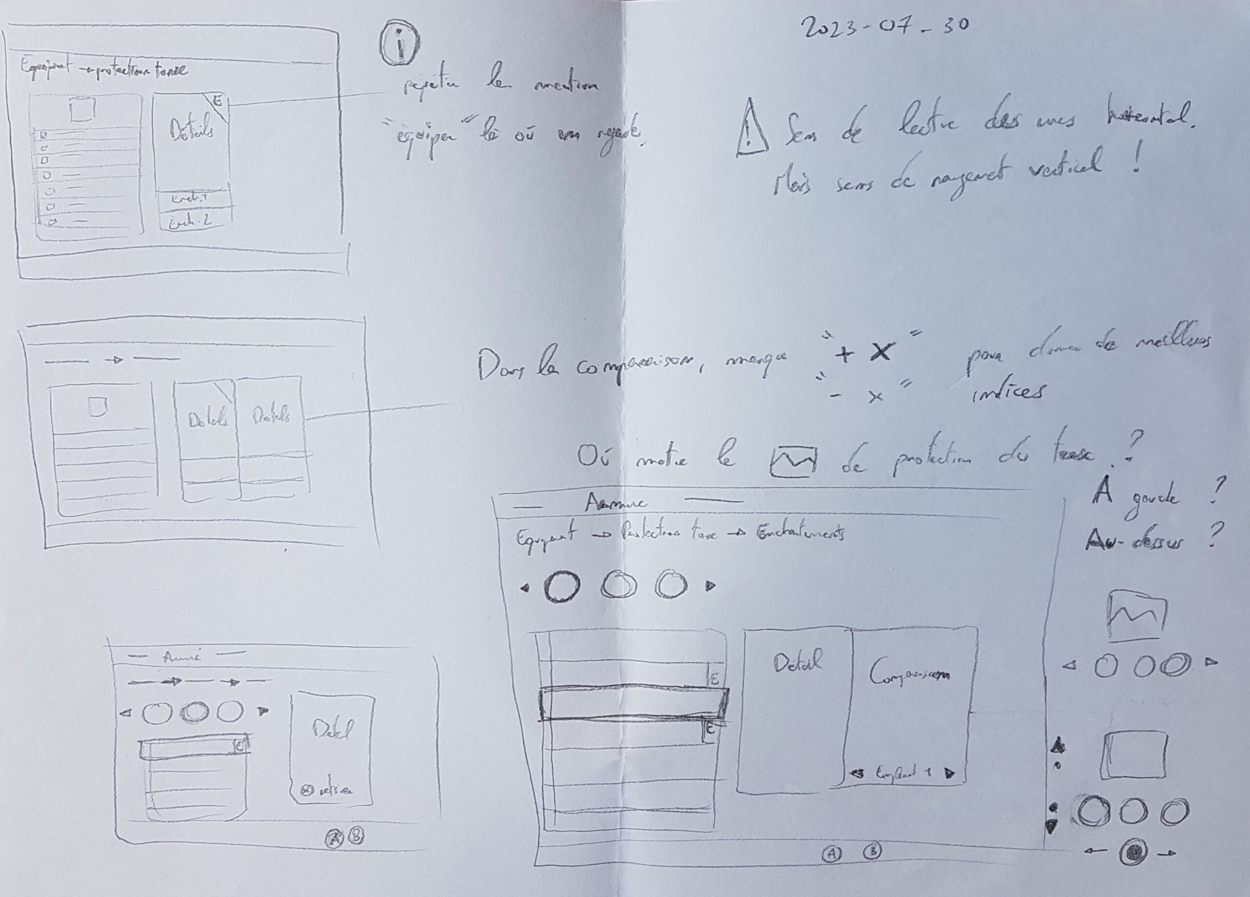
Problem
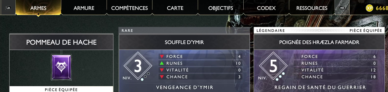
The characteristics of objects are only visible when they are hovered over, forcing users to scroll through the list to create their build.
Solution
Provide an index of the object’s characteristics in the list, using a characteristic icon for example.
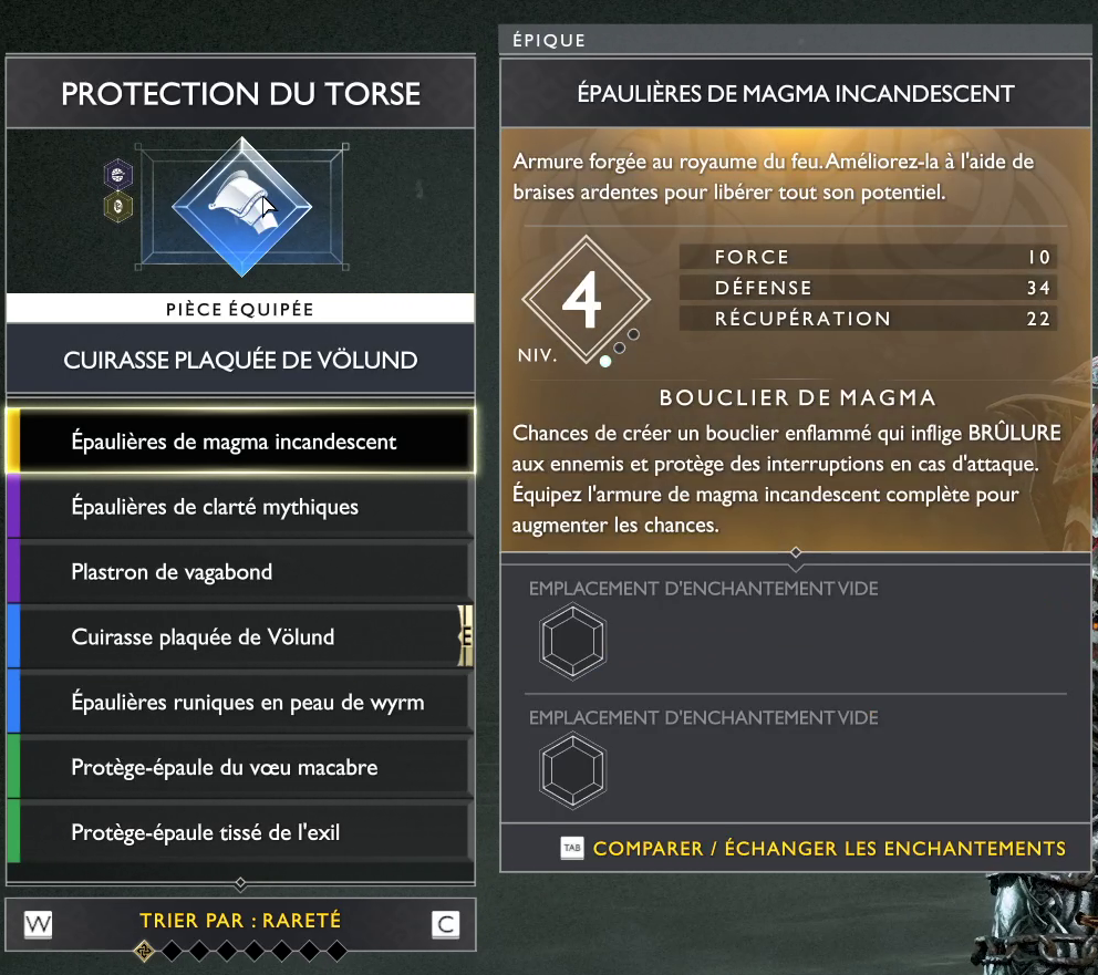
Problem
The equipped part characteristics can only be viewed by finding the item in the inventory, although its icon is right in front of us.
Solution
Allow the hovering of the equipped item to limit minimal actions.
Problem
Although this item’s appearance is identical to other clickable items, this one is not.
Solution
To improve affordance, use a different format to items which can solely be hovered.
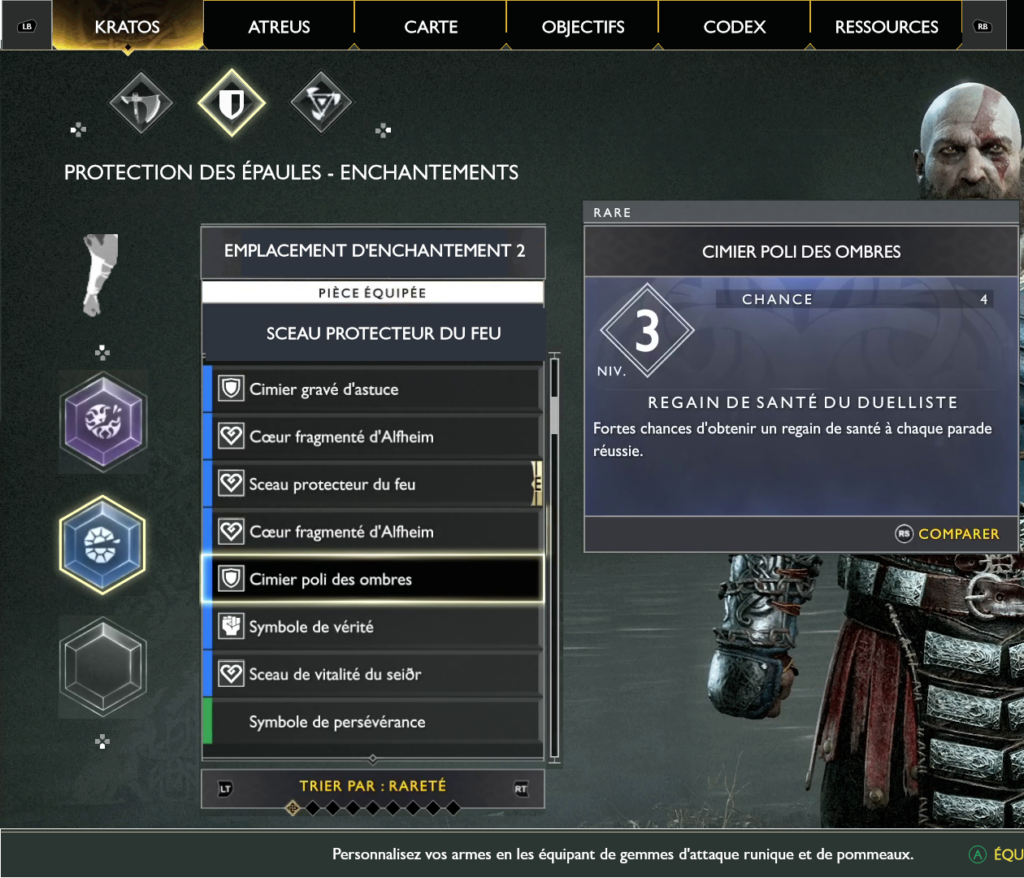
Problem
In an RPG, we’re used to equipping a character. The information architecture gives precedence to the armour category, which limits the sense of identification with Kratos and Atreus, as well as blurring the distinction between their respective equipment.
Solution
Adapt the information architecture so as Kratos and Atreus each have their respective equipment room.
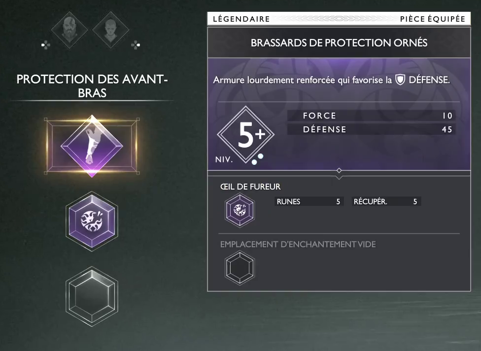
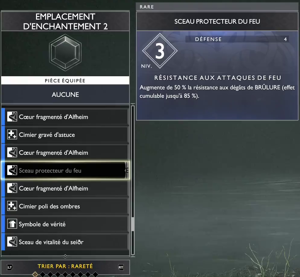
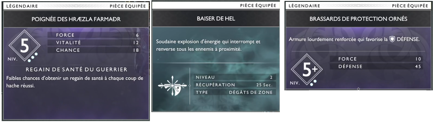
Problem
It’s good to know that an enchantment is already embedded elsewhere, but without information about the item in question, it’s hard to know whether you’re making a mistake by replacing it.
What if the item is equipped?
Solution
Add information about the item wherein the enchantment is embedded. Which one is it ? Is it equipped ?
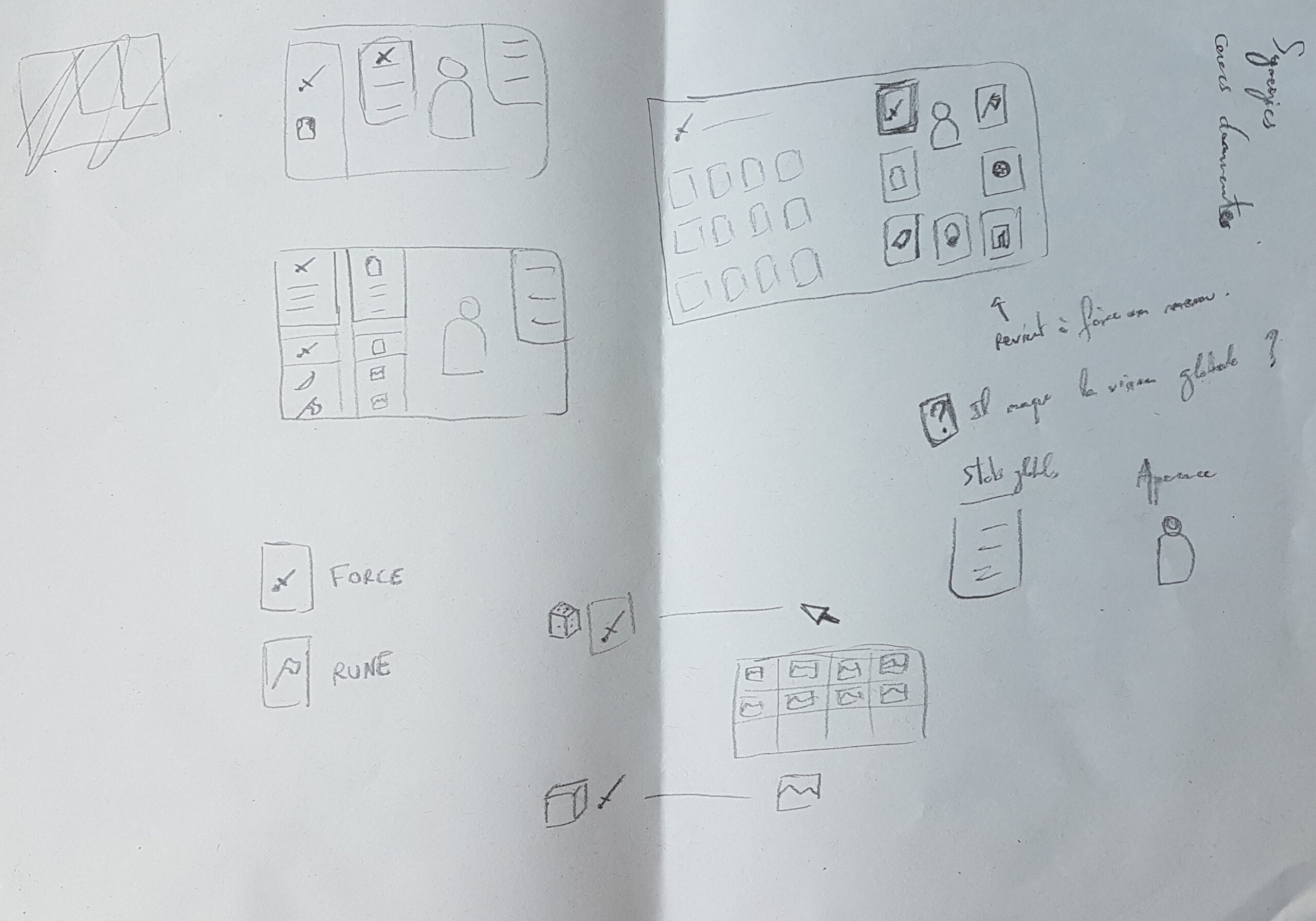
Problem
The icons on enchantments, talismans and knobs use a symbology that is not explained anywhere.
So it’s hard to assign a meaning to these symbols.
Solution
Replace these icons with the more understandable and widespread Kratos characteristics icons. It’s true that a certain amount of information will be lost, but what remains will be effectively understood.
Problem
Most of the text is in upper case, which makes it difficult to read.
Solution
Improve accessibility by favouring lower-case letters, which are easier to read.
Problem
On some objects, the power is written before the description. On others, it’s the other way round.
Solution
Homogenise the zoning of objects by maintaining the order of features.
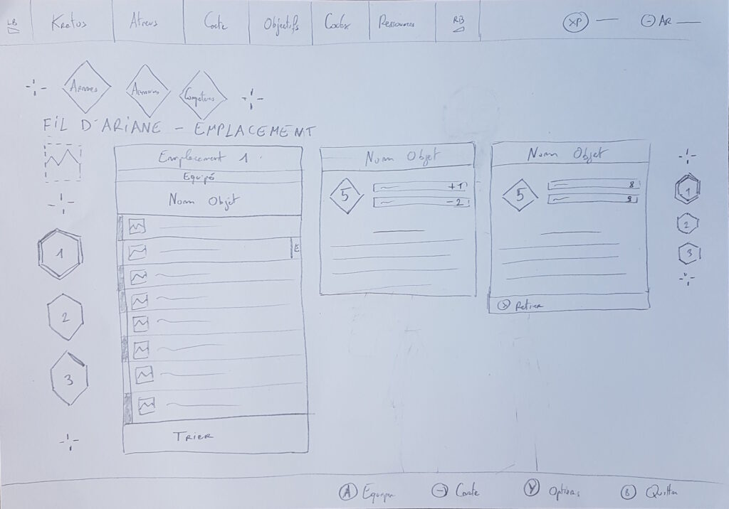
Sketches to design
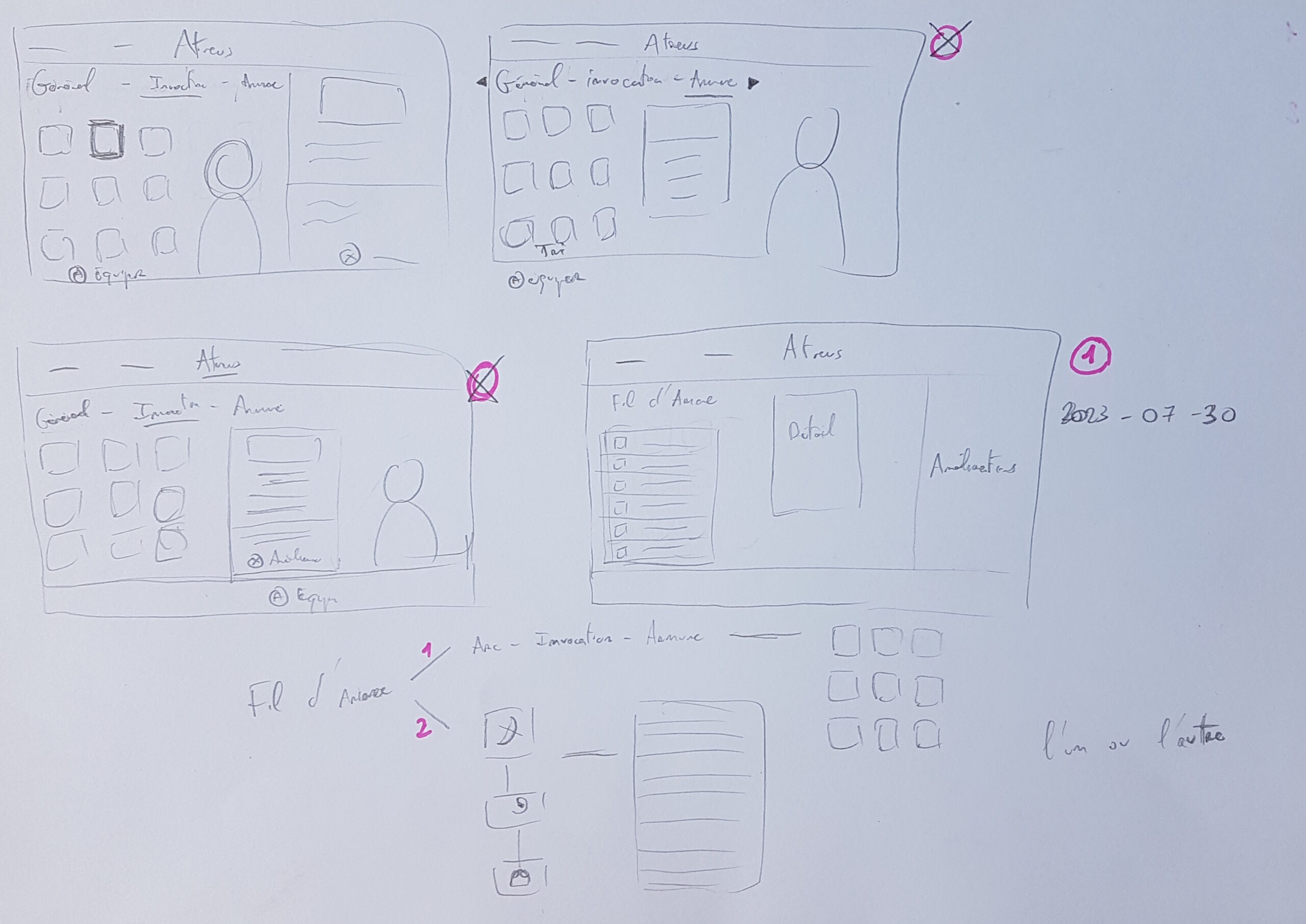
Sketches used through the design process
Limitations
I am aware that the work carried out and the resulting design are not free of limitations.
As mentioned above, I can only make assumptions about the designers’ original intentions for the interface produced.
Secondly, although the interfaces have been tested and iterated, larger-scale tests could be organized to reach a more representative range of end-users.
Finally, an equipment management interface is part of a wider context of use than simply changing objects. The design can only be truly tested against the yardstick of a holistic experience, and therefore on longer, more ecological gameplay slices. How can such a design withstand the rise in expertise inherent in hours of gameplay? And does it convey the right information throughout the gaming experience?
These are just some of the questions I have left unanswered in this portfolio presentation, but which I would be delighted to explore.
What I learnt
In the course of creating this portfolio, I have learnt that design choices are sometimes difficult and won’t satisfy all players. Some are artistic, others practical, and others target one category of gamer rather than another. Designing a video game means striking a fine balance that users won’t necessarily be aware of.
In my future designs, I will take care to respect the artistic intentions and the choices made upstream to create an interface that is faithful to the wishes of all the stakeholders.
I also learnt that although the path to take is clear, even simple tasks can take a long time to process. This project was done on my free time and I spent way more time refining it than I expected. Quality takes time !
Finally, bringing this project to fruition has confirmed my enthusiasm for the video games sector and the exciting challenges it presents.
Conclusion
Although God of War 2018 is an exceptionally high quality production that has been recognised by the entire video game industry, there is still room for improvement in certain aspects of the user experience. It’s been a pleasure to work on this project, and I hope you have enjoyed reading it too.
If this glimpse of my work has convinced or intrigued you at least, I’would be delighted to discuss it with you.